
Apr 8
UX Improvement: Increase the hit area for the audio icon
Hi DuoCards team,
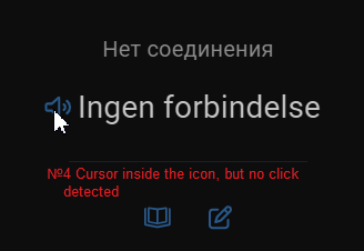
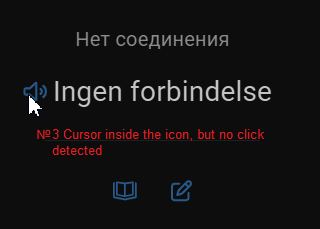
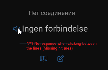
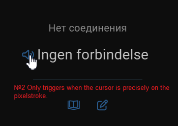
I’m a frequent user of the desktop version, and I’d like to suggest a small but important UI fix.Currently, the speaker icon (audio/pronunciation button) on the flashcards has a very fragmented hit area. To trigger the sound, the cursor must be placed exactly on the blue lines of the icon. Clicking in the gaps between the lines or slightly next to them does not work.Suggested fix:
Please increase the hit area (click target) for this button. It should be a solid rectangular or circular area around the icon, not just the paths/lines themselves. This would follow Fitts's Law and make the learning process much smoother for desktop users.
Completed
Another problem is that long sentences don't appear in full on the card.