
Dec 7
Make Suggested Example Phrases More Visible and Clearly Clickable
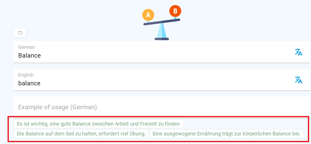
Not really a bug, but when adding a word manually on a computer, the suggested example in green does not have a cursor: pointer, the phrases look very small to notice them, they can not be translated there (which is not very helpful since people would want to know which example could be better. It can be translated down below but not there) and the phrases do not have any kind of hover or appeareance of a clickable object. Just things that could make the UI better.
Closed
Hello, we're going to archive this post for now, as it didn´t get so many votes, but don't worry, it's definitely noted.